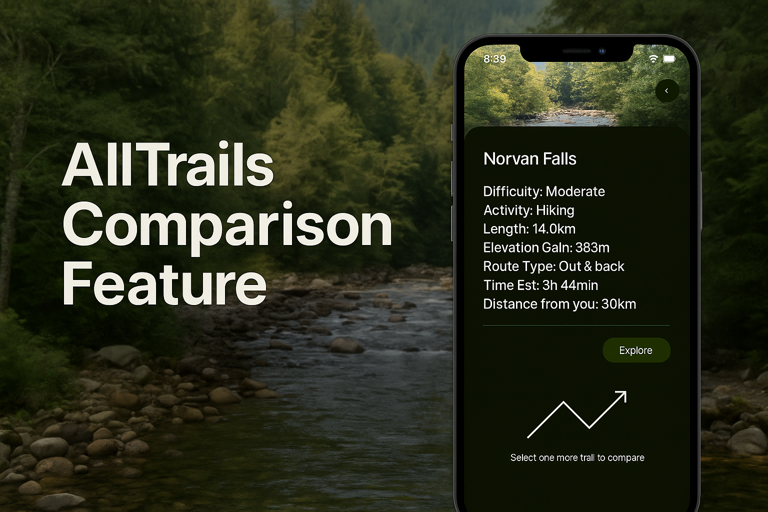
AllTrails Trail Comparison Feature
Designing a concept feature to simplify trail selection through streamlined comparison.

About the Project
This project was completed as part of a user interaction design course at Simon Fraser University. The objective was to enhance an existing mobile application by designing a new feature that addressed a real user need.
I chose to work with AllTrails, a widely used hiking and outdoor exploration app that helps users discover trails, view difficulty ratings, track hikes, and read community reviews. With a large database of trails and GPS-integrated navigation features, the app is popular among both casual hikers and seasoned adventurers.
Research & Key Insights
To better understand how users interact with AllTrails, I conducted a combination of informal interviews and online research. I spoke with two users: one was a regular hiker who frequently uses AllTrails to discover and plan hikes, while the other was a casual hiker who turns to the app occasionally when in the mood to explore local trails.
I also reviewed feedback from online forums and app reviews to supplement these perspectives. While both users praised the app’s trail database and filtering tools, they echoed a common frustration: comparing trails was inconvenient and clunky. Users often found themselves flipping between individual trail pages to recall details like elevation, duration, and difficulty, which led to decision fatigue and slower planning.
This feedback, combined with my own experience exploring the app, revealed a consistent usability gap in an otherwise well-loved platform.
The Problem
After synthesizing user feedback and personal exploration, it became clear that the core issue was a lack of trail comparison functionality within the AllTrails interface. While users could easily discover and filter trails, the app offered no efficient way to view multiple options side by side.
This gap disrupted an otherwise smooth experience and introduced unnecessary friction into the decision-making process. From a UX standpoint, this presented a clear opportunity: to design a comparison feature that supports user goals without overwhelming the existing interface.
Design Strategy
During the design phase, I identified two core user scenarios that shaped the direction of the comparison feature:
- Comparing two known trails: Users already have two options in mind and want to compare them directly to decide which one suits them better.
- Validating a single trail: Users are focused on one trail but want to ensure it’s the best fit by checking how it stacks up against similar alternatives.
To support both use cases, I designed a flexible comparison flow that could be accessed from both the trail page and the map view. This allowed users to initiate a comparison from wherever they were in the app without breaking their planning process.
The flowchart below illustrates the key user paths that guided my design direction, highlighting how users currently navigate the app and where friction points emerge.
Feature Highlights
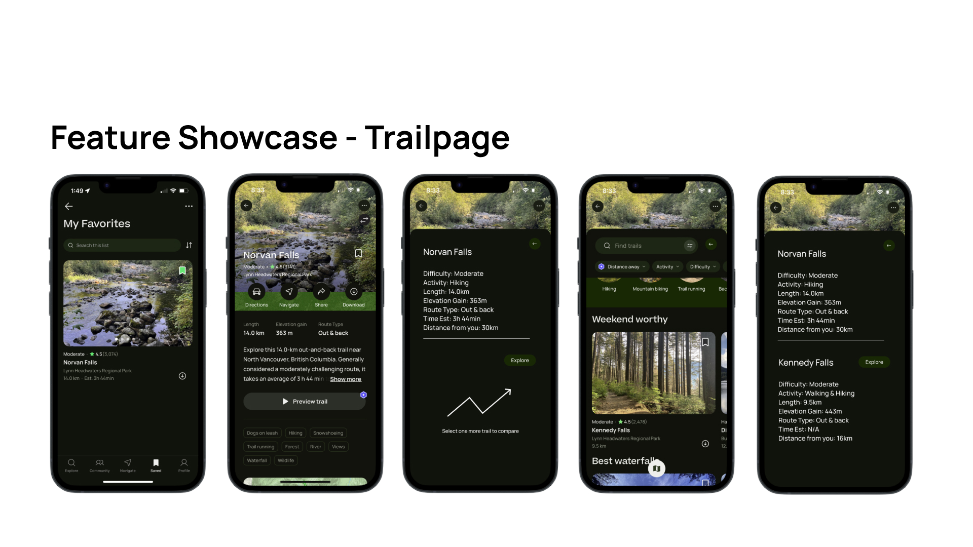
Trail Page Integration
A new “Compare” button was added to the trail detail page, allowing users to initiate a comparison directly from the trail they are viewing. Once selected, the user is prompted to select another trail to complete the comparison.
This interaction supports users who already have a specific trail in mind and are seeking a quick way to validate whether it's the best choice for their goals.

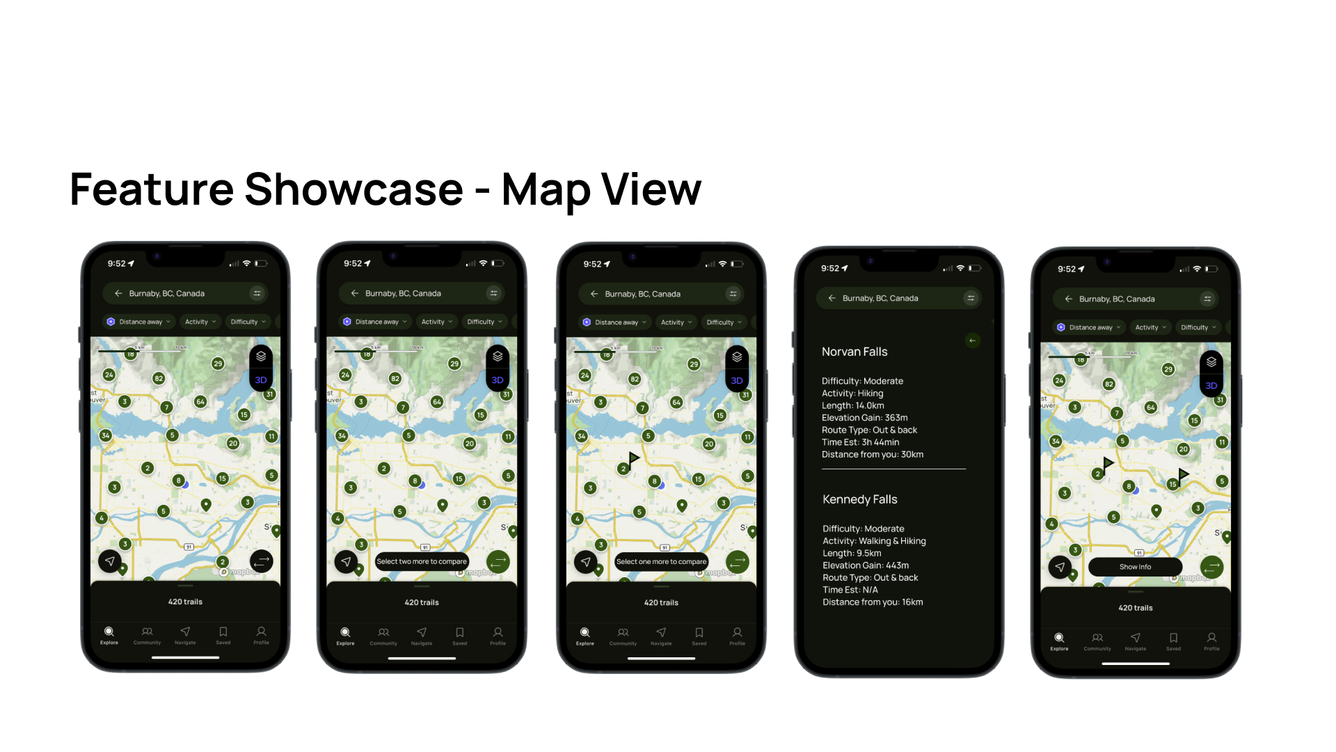
Map View Integration
The map view now allows users to tap on trail pins and select multiple trails for side-by-side comparison. After choosing two trails, users are shown a condensed summary comparing distance, elevation, difficulty, and estimated time.
This feature supports users who are actively browsing for trails within a region and want to quickly assess which options best match their needs without navigating away from the map.

Reflection
This project was a valuable opportunity to practice designing within the constraints of an existing product. Rather than starting from a blank canvas, I had to carefully study the structure of AllTrails and ensure that any new feature would feel native to its existing design language and user flows.
Working with a limited scope also pushed me to focus on the core value of the feature: reducing friction in trail comparison. While the idea of comparing trails might seem simple on the surface, it raised important questions around entry points, user intent, and how to balance additional functionality without adding clutter.
If I were to expand on this project, I would explore more edge cases (e.g. comparing more than two trails), as well as deeper integration into list-building and saved favorites.
Overall, this case study strengthened my ability to identify pain points, translate them into user needs, and design practical features that enhance everyday decision-making.